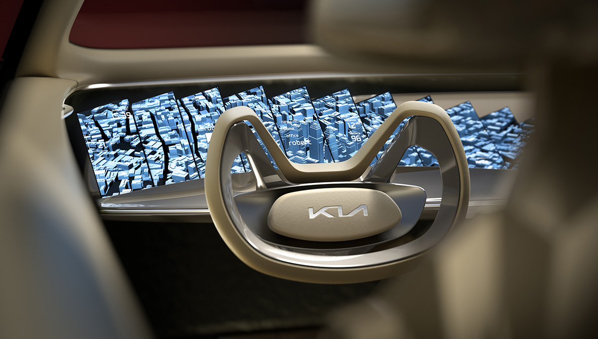
When Kia introduced the Imagine by Kia concept years ago, one of the things that caught my eye was the odd logo on the steering wheel, a huge departure from the traditional Kia logo that we’ve become accustomed to. At the time, most thought it was just part of the futuristic concept. But as it turns out, it was a glimpse at the future logo of Kia.
Today, Kia took to the sky in a crazy record-breaking pyrotechnic display, where the new Kia corporate logo was displayed. And when I first saw it, I was like “What the hell is KN?” If anything, the new logo took away the spacing, and it’s even harder to decipher now.
Yeah, if you squint ever so slightly, you can sort of make out the KIA letters, but it’s likely going to have a lot of people confused when they first see it. The brand says the new logo embodies “symmetry,” rhythm” and “rising,” and it’s supposed to look a lot more like a handwritten stamp of approval from the company while inspiring confidence.
Kia also introduced a new slogan: “Movement that inspires,” which replaces their current slogan “The Power to Surprise”, though I don’t know if I’ve ever actually heard that one.
Sorry guys, but I’m not a fan. It seems like brands are going out of their way to make their logos worse (see BMW, Nissan, GM, etc) for some reason, and the Internet has a field day making fun of these horrible designs. My take on this? If it ain’t broke, don’t fix it.
What do you think of Kia’s new logo and slogan?


Recent Comments